MapleDesk
A site that lets a busy consultant try the app before installing anything.
- Client
- MapleDesk, our own product
- What
- Product site, guide, help and security pages
- We did
- Design, drawings, copy, build, seven languages
Explain a desktop app to someone with no time.
MapleDesk is practice software for Canadian immigration consultants, and it’s our own product. The people it’s for work alone or in small firms, with client deadlines every week.
The site had two jobs. Show what the app does without asking anyone to install it first, and earn enough trust that a consultant would put client files in it.
Fourteen open files, and one of you.
The headline is the consultant’s own Monday: 14 open files, 3 deadlines this week, and one of you. Beside it sits the app’s real morning list, not a stock photo standing in for software.
We built four openings and five versions of the leaf behind the logo, and kept every one on the live site behind a link so they could be compared on a real screen. The dark green “night desk” won.
The first version played a film as you scrolled. We replaced it: most scroll positions caught the film halfway between two scenes.
Four things you can do before you book.
A screenshot shows what an app looks like. It doesn’t show what using it is like. So each of the four chapters builds itself as you scroll, then holds still and works.
Tick off the morning’s tasks. Send a client one secure link for their documents. Pick a province and watch the invoice tax change, using the app’s real rules. Test a backup.
Filmed on the live site at true speed. Phones get the same pieces, stacked.
A manual that looks like a manual.
The How it works page is deliberately unlike the home page. It’s a short manual: ten numbered steps, the time each one takes, notes in the margin and a common question under each.
Where a screenshot can’t show the idea, a line drawing draws itself. It ends with a “Before day one” checklist that keeps its ticks in the visitor’s own browser, and it has its own layout for printing.
Trust is in the small print.
A consultant deciding where to keep passports and status documents reads more carefully than most visitors. The pages they check are written as plainly as the home page.
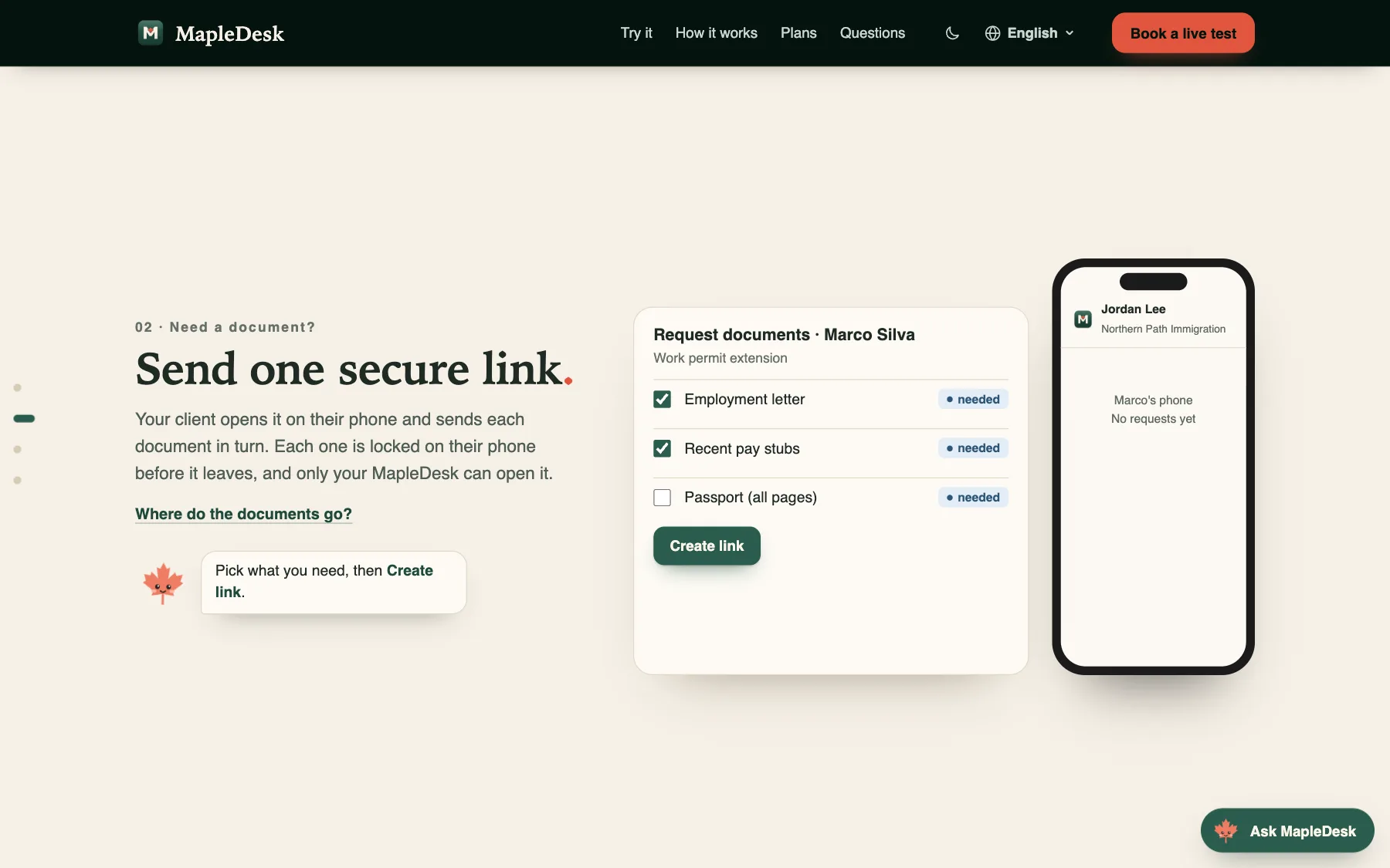
The client’s side, shown too
The secure-link chapter shows the request and the client’s phone together, so a consultant sees what they’d be sending.
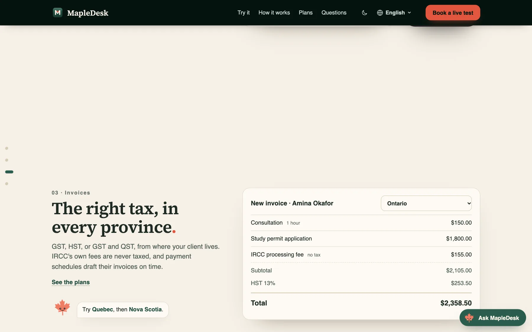
Real tax rules, not a mock-up
Change the province and the invoice recalculates with the app’s own rules. Government fees are never taxed.
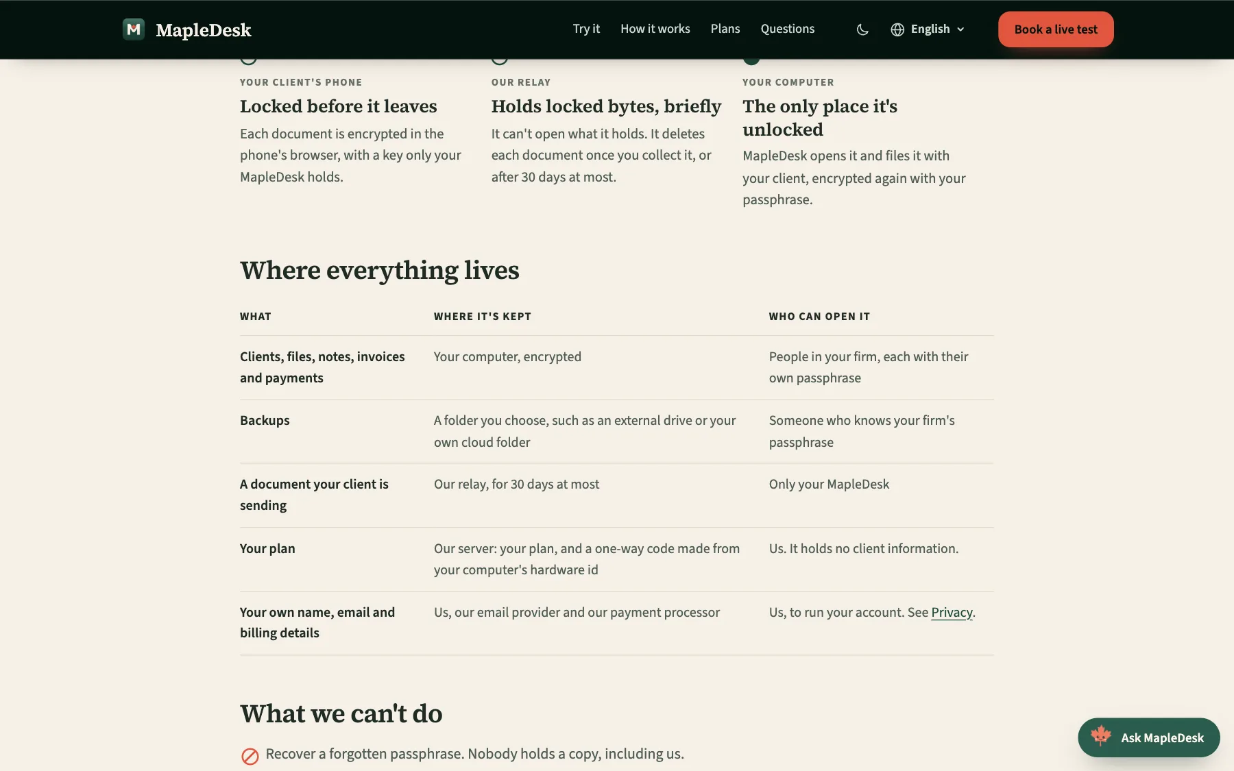
A page for what we can’t do
The security page says where everything lives and who can open it. Then it lists what we can’t do, and what we haven’t done yet.
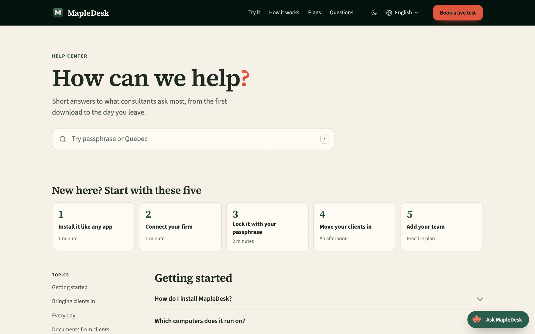
Help that starts with five steps
The help center opens with search and the five things a new user does first, each with its time.
Seven languages, and no page half-translated.
Many immigration consultants work in the language of the families they serve. Every page is built in English, French, Spanish, Punjabi, Hindi and both Chinese scripts.
French uses Canadian terms. The build stops if a single phrase is missing in any language, so a page is never half-translated. The app itself is in English, so its screens stay in English on every page, and each language says so.
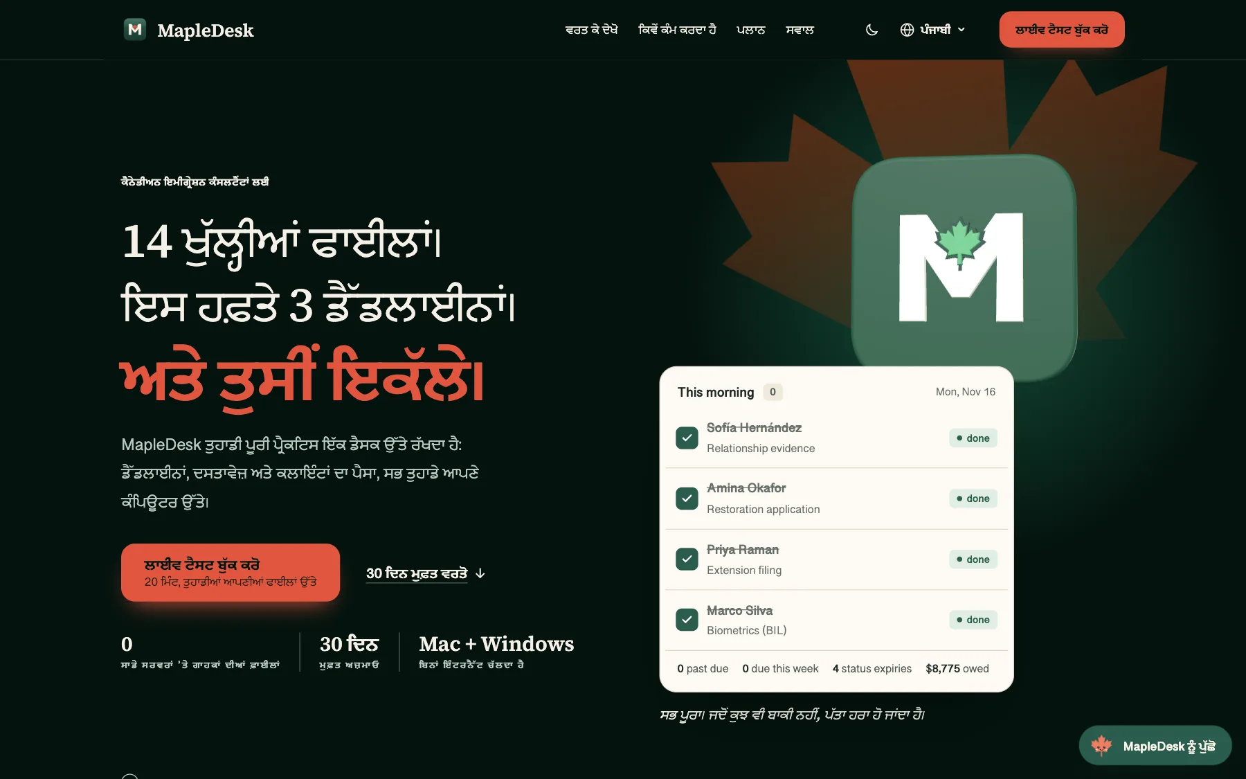
The Punjabi home page. Punjabi and Hindi use the visitor’s own system fonts for those scripts.
We measured the scroll, then fixed it.
The first build felt heavy on a phone. We measured it with a scripted scroll at normal speed and with the processor slowed four times, and found the cause: the 3D logo was loading before the page.
Now a flat logo stands in at the same size and the 3D one loads after. Captions and reveals move without changing the layout. Smooth scrolling runs on desktop only; phones keep their own.
- Lighthouse score on a phone42 before, 90 after. The guide page scores 98.
- Layout shift while scrollingUp to 0.051 before, 0 after.
- Worst single frame250 ms before, 17 ms after, on a mouse wheel at normal speed.
Measured on 24 October 2026, before and after the changes. Layout shift was measured again on 16 November: still 0.
Small, steady and quick to show.
Measured on the live home page on 16 November 2026, at phone size with the processor slowed four times. The Lighthouse score is from 24 October.
Start with a brief
A brief about your business and what you need. We usually reply within one working day, to the email or phone number you give. Sending one is free and commits you to nothing.